
As part of my secondary research in my Graphics A-Level work I was required to look at existing artists and gain an understanding for how they created their work, why each method was chosen and the different medias they've used.This thread looks at one of those artists called Matas Zaloga. Matas is the director of Zazu.tv which is a company specialising in animation, illustration and motion design. Matas prides himself on attitudes towards welcoming challenges despite how large they may be. Matas inspires me through his sole use of digital media and the detailed yet clear graphics he produces, perfect for advertising as evidenced in the 'Visit Lithuania' project on his profile.
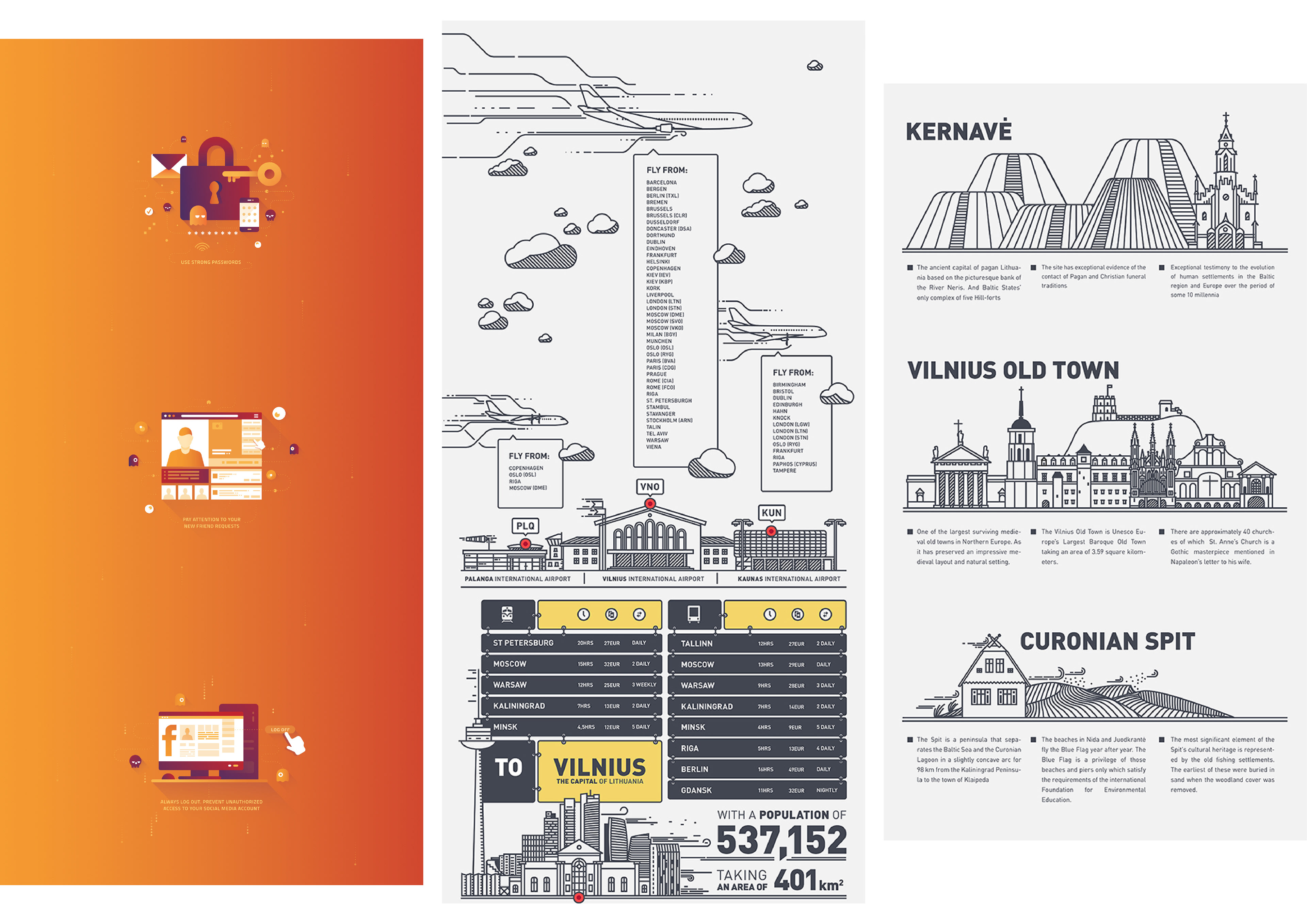
Further to researching Matas's work I was tasked with replicating three pieces using the same media and in the same method. This is to expand my skill set and learn new ways of creating graphics.
When replicating Matass work it gave me a chance to become more familiar with Adobe illustrator and how it can interface with Photoshop. This was a skill I later used when creating my primary photo replications and also creating my watch in the STAGER work. In each of the three replications the use of weight of line really stood out to me and showed me how it can be used to draw attention to different aspects and add detail.

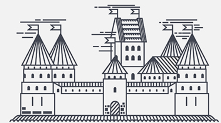

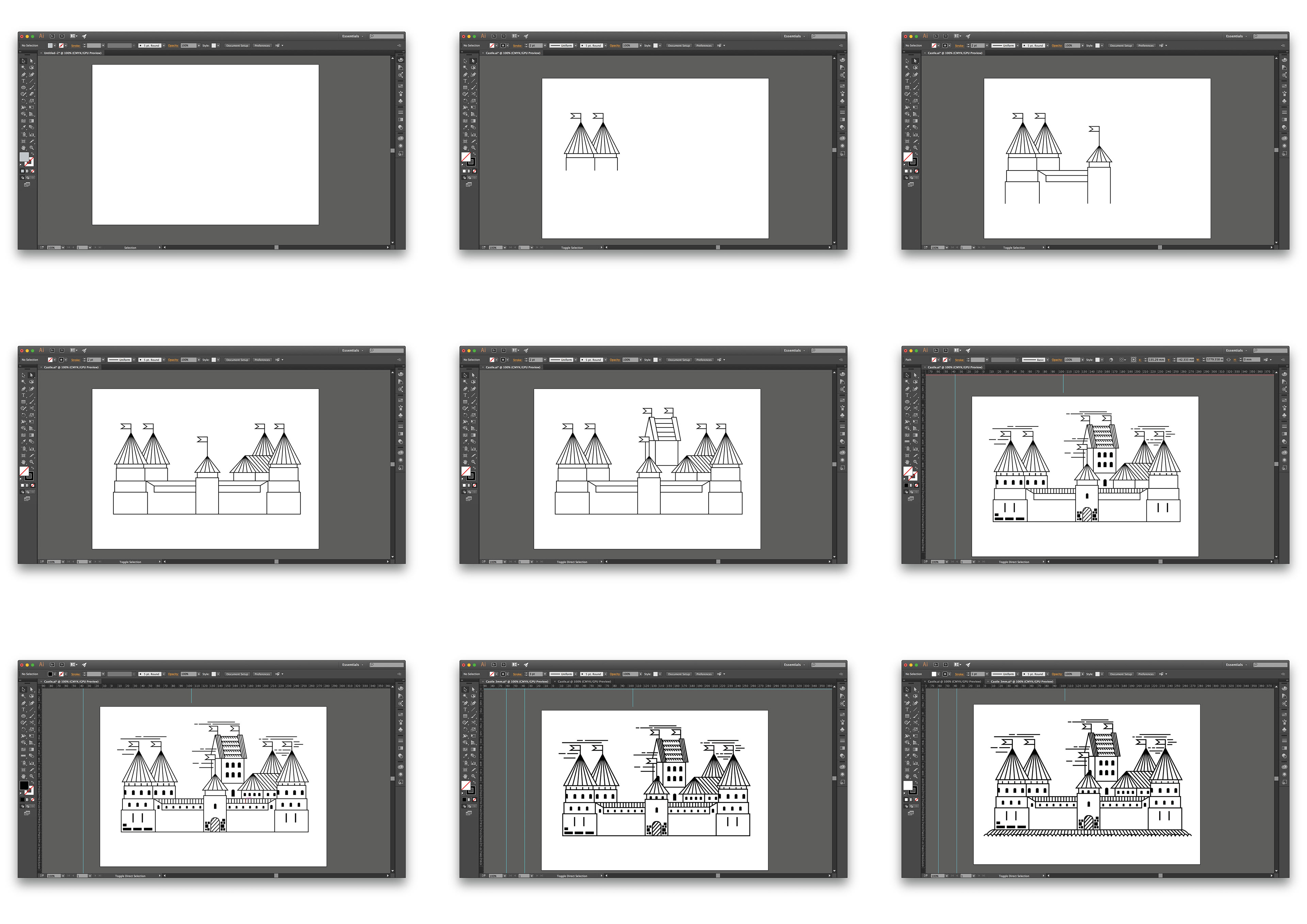
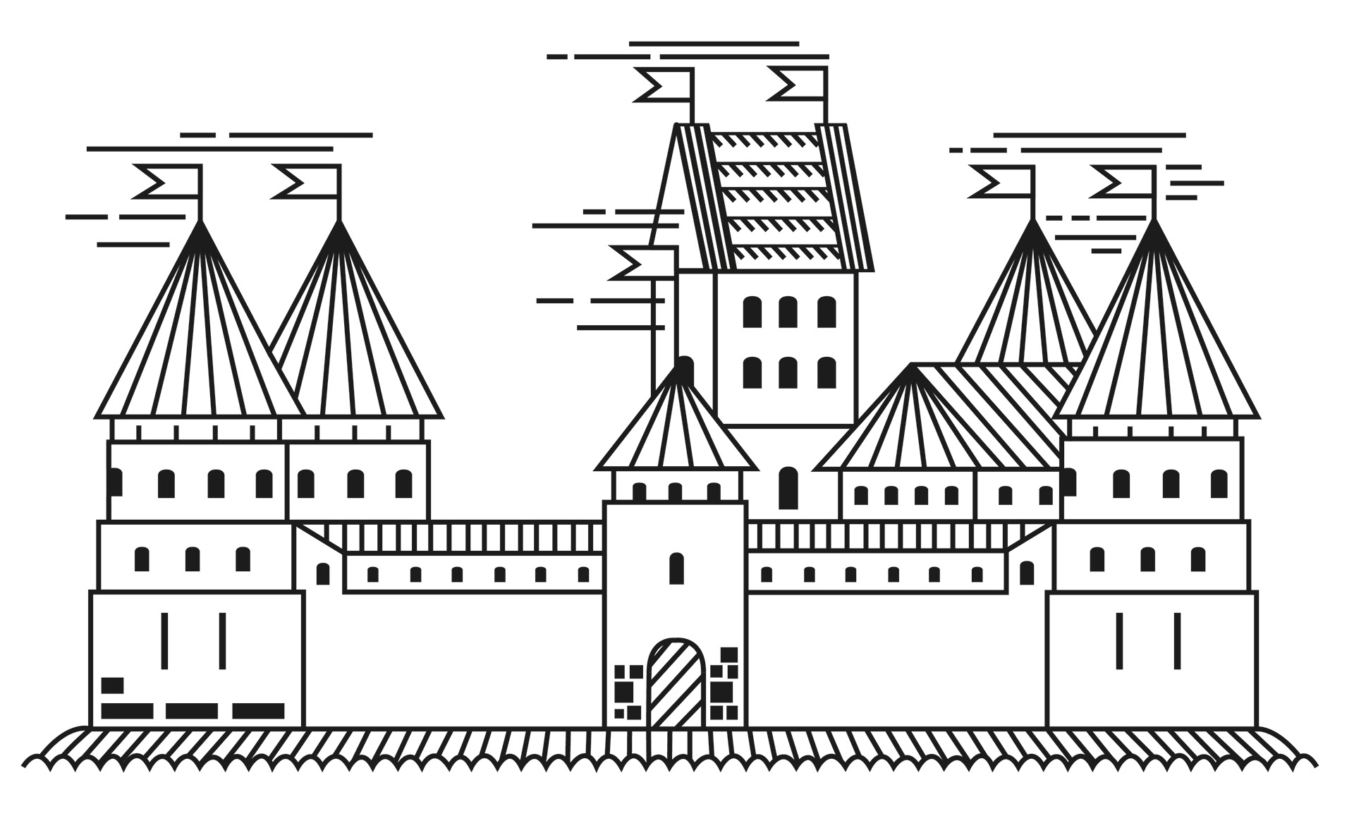
I created this replica using Adobe Illustrator. I feel that my copy is of a accurate due to being of a very similar proportion, style and weight of lines; leading to my version of Matas’ work being recognisable and in the large part an exact copy. From creating the replica I’ve become more familiar with Illustrators’ ‘Blend Tool’. This is a tool which can create lines of an equal distance between two end points, the tool can be told to use a specific amount of ‘steps’ or to space the lines in a certain direction. Something I found frustrating during the replication was ensuring that the lines met each crater perfectly within the ‘skirting’ situated at the bottom of the castle. This was because I felt that if the lines met the bottom of each dip then the overall image would appear to be clearer. From creating this replication, I can take forward the skills developed in Illustrator such as the ‘Blend Tool’ and I could also take forward the use of line to create motion.


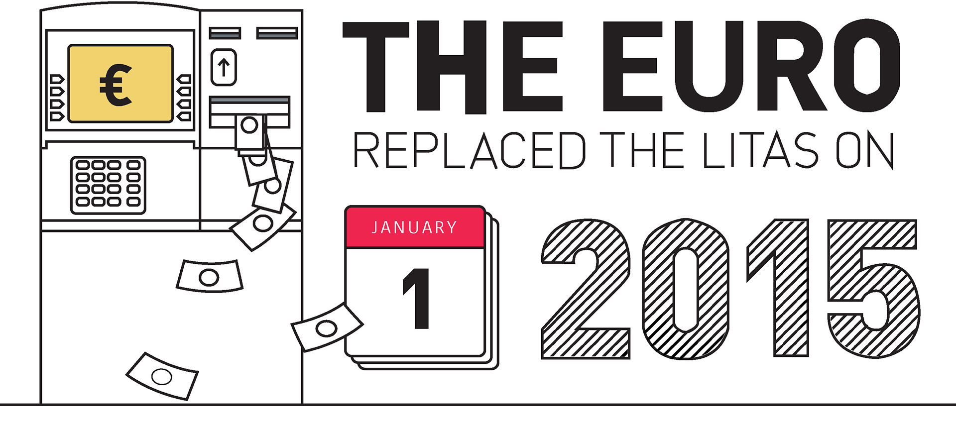
To create this replica, I used Adobe Illustrator due to it being the same method which the artist used. Within Illustrator key tools I used were the ‘Pen Tool’ and ‘Blend Tool’. From using the two tools I feel my confidence and knowledge has improved and that I now feel I can see how images have been made digitally using these tools. When creating the replica I generally found the method very straightforward as I feel my previous skills allowed me to create smooth lines to which resembled shapes. I did however find a more troubling challenge when making the ‘2015’ title. This was because I the lines from one character to the next weren’t of an equal spacing nor an equal number of lines, so when using the ‘Blend Tool’ I needed to create a consistent flow of lines before exporting the image to Photoshop. Once on Photoshop I could then use the wand tool to select the outline of shape I’d made and delete the excess lines. This was something which needed to be done for each character. From creating this replica I’ve learnt how basic colouring can make a image pop without needing for a varied amount of colours. I’ve also learned about the effect that both bolder and singularly cross hatched text can have in terms of drawing the viewers’ attention.


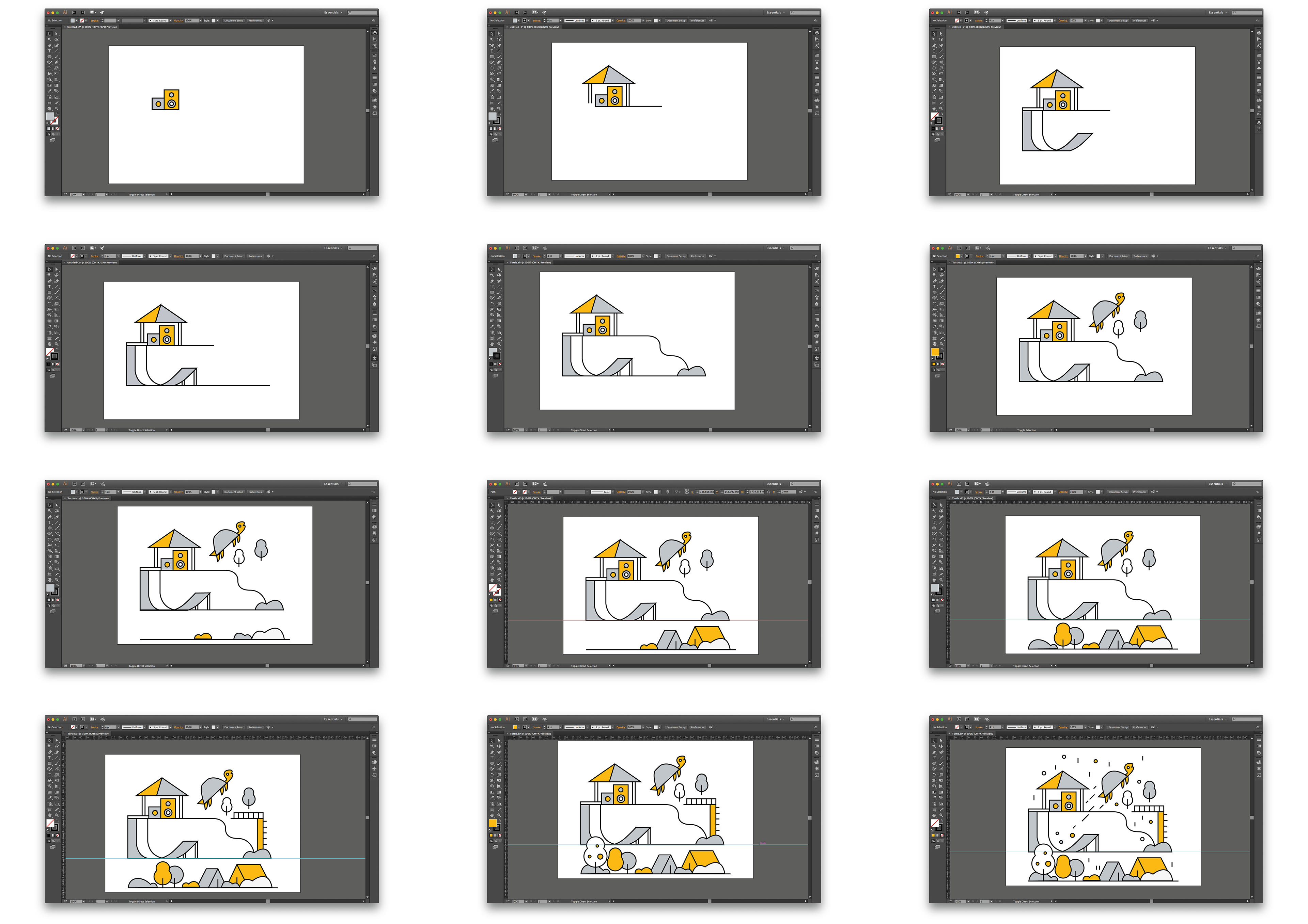
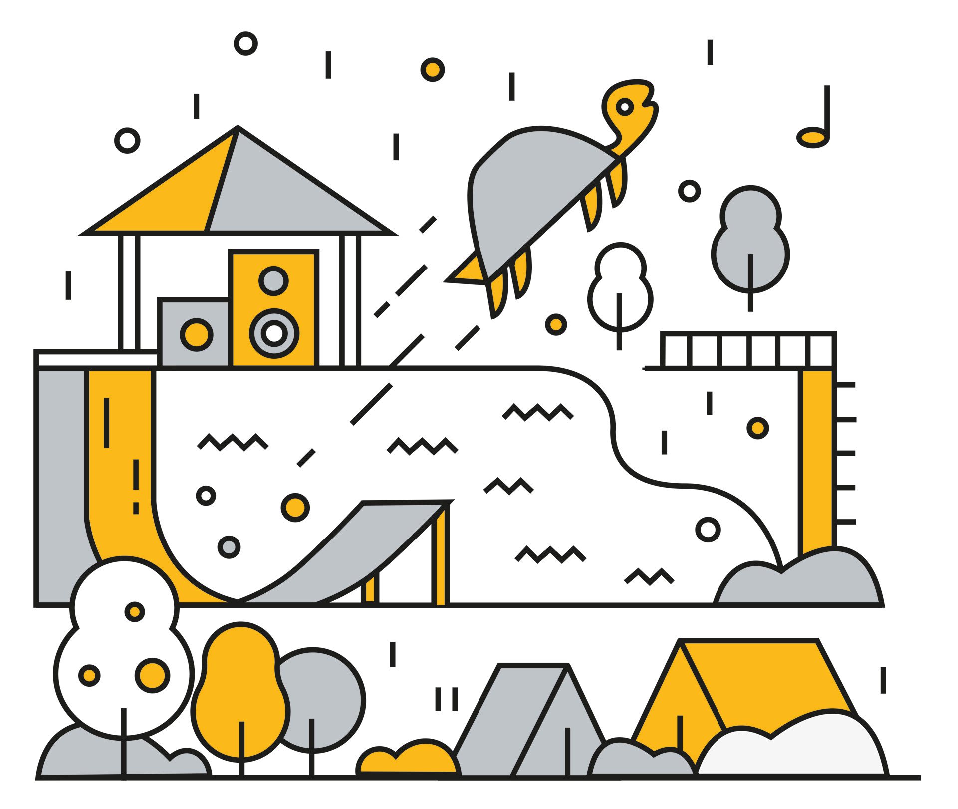
The method which I used to create this replica was through Adobe Illustrator. I feel that my replica is almost a copy of the original due to my use of line through the pen tool, shapes and colour have led me to have a very accurate replica. A skill which I’ve developed/become more familiar with is Anchors. Using Anchors I can add extra points to shapes and then move that point, anchors can also be added to smooth curves and make the shape more consistent. When creating the graphic struggle to create a well-proportioned curve on the ramp, this was because the lines at the begging of the ramp didn't follow on to the end section of the ramp neatly. This meant that they needed to be individually created, whilst this wasn’t an issue I found it to be an irritating flaw in the graphic considering that all other elements flowed consistency and proportions were appropriate. From creating this graphic I can take forward the use of layout, shapes and lines to create an interesting graphic.